TIP: Responsive grid using CSS
almost the most common CSS problem to any project I had is mobile responsiveness. Many ways to do it using @media attribute, but I found most useful oneliner to make items responsive:
CSS:
1
2
3
4
5
6
.container {
 display: grid;
 grid-template-columns: repeat(auto-fit, minmax(230px, 1fr)) ;
 grid-gap: 0rem;
 height: inherit;
    }
HTML:
1
2
3
4
5
6
7
8
9
10
11
12
13
<div class="container">

       <div>item1</div>

       <div>item2</div>

       <div>item3</div>

       <div>item4</div>

       <div>item5</div>

</div>
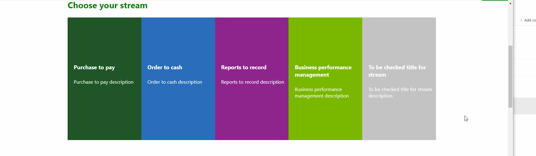
result with more style around items, but responsiveness is from css above.